Which country is winning the 2016 Olympic games?: A Tableau Visualization
August 17, 2016
Python code for data acquisition
Related visualization: Olympics results normalized by sports
Weighting gold vs. silver vs. bronze medals
After each Olympic games, there’s often a debate of which country “won” the Olympics. This debate is often between people who disagree on whether the total number of medals or the number of gold medals is most important. Perhaps for others the answer lies somewhere in between, and using the interactive data visualization below, we can weight the value of each medal and see how that affects each country’s standing.
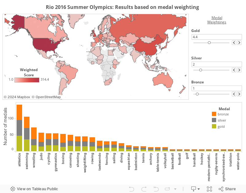
In this visualization, you can:
- Vary the weights of gold, silver, and bronze medals.
- Select a country on the map: see in the bar chart how their medal count faired in each sport.
- Select a sport below the bar chart: see the weighted medal score for each country for only that sport.
- Select a certain medal type (gold, silver, bronze) in a given sport’s bar: see the worldwide distribution of a certain medal type.
Note that the ‘Independent Olympic Athletes’ were arbitrarily mapped onto Greenland.