Income inequality in USA, visualized
January 26, 2020
Income inequality is one of the biggest problems in our society. It’s pretty messed up that there are so many people struggling to meet basic needs and having financial difficulties in life, while many of us live in relative luxury because we were lucky enough to be inclined in the skills that industries value (and/or be born into wealthy families).
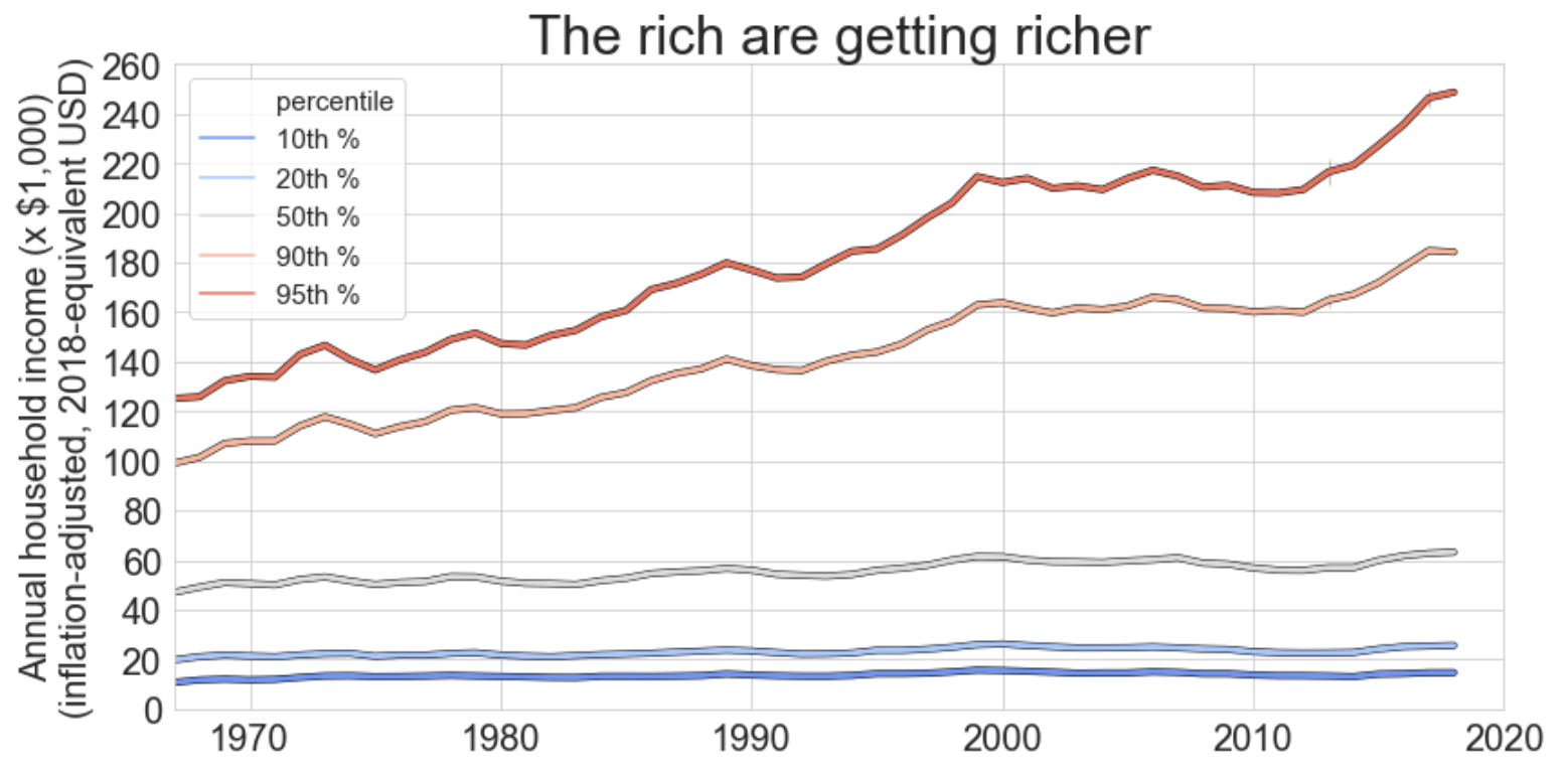
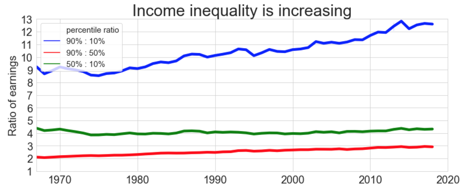
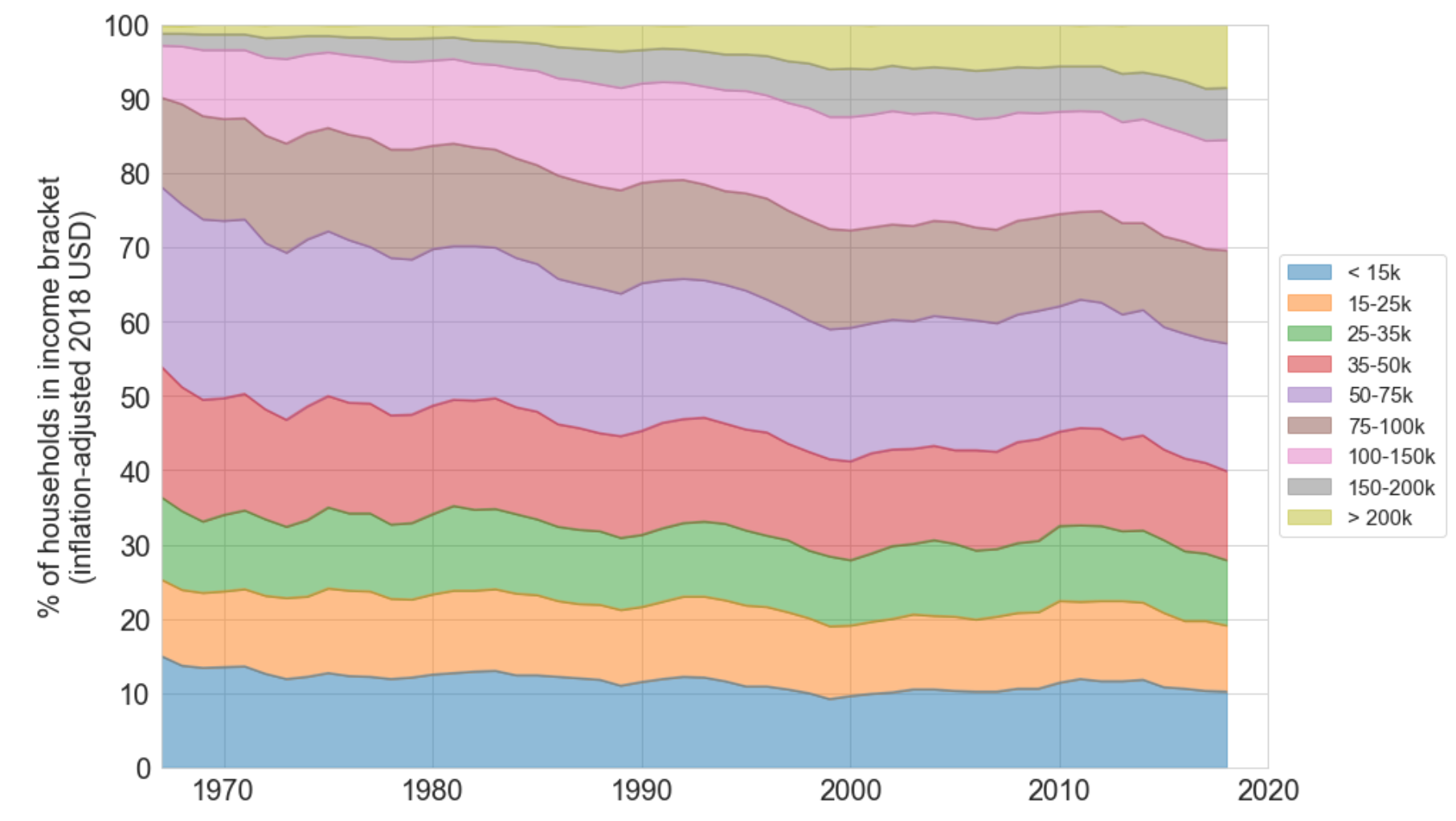
I had heard that “income inequality is getting worse,” but I never really had a quantitative perspective. Therefore, I downloaded some data from the Census Bureau and visualized it below. Overall, it seems like “the rich get richer, and the poor get poorer stay about the same.” The most prominent trends are:
- The 90th percentile of households now earn 13x that of the 10th percentile, and 3x that of the median household.
- Over the past 40 years, incomes have increased more rapidly (in both relative and absolute terms) for the more wealthy households.
- While the inflation-adjusted income of the 90th percentile has increased 14% in the past 10 years, the income of the 10th percentile of the population has only increased by 3%.
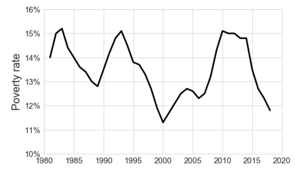
- The official poverty rate has fluctuated over the past 40 years between 12% and 15%, and as of 2018, we are in a relatively good period (11.8% poverty rate).
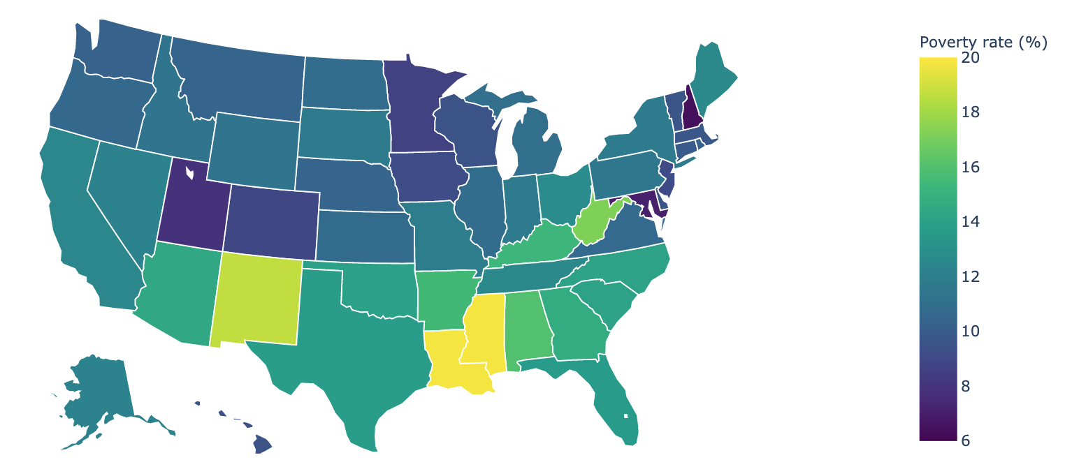
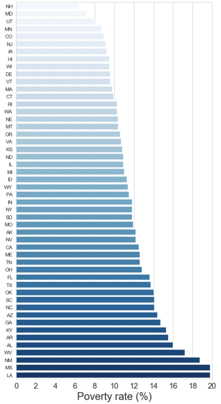
- The southern states have the greatest rates of poverty (Louisiana and Mississippi have poverty rates of 20%). New Hampshire has the lowest poverty rate (6%).
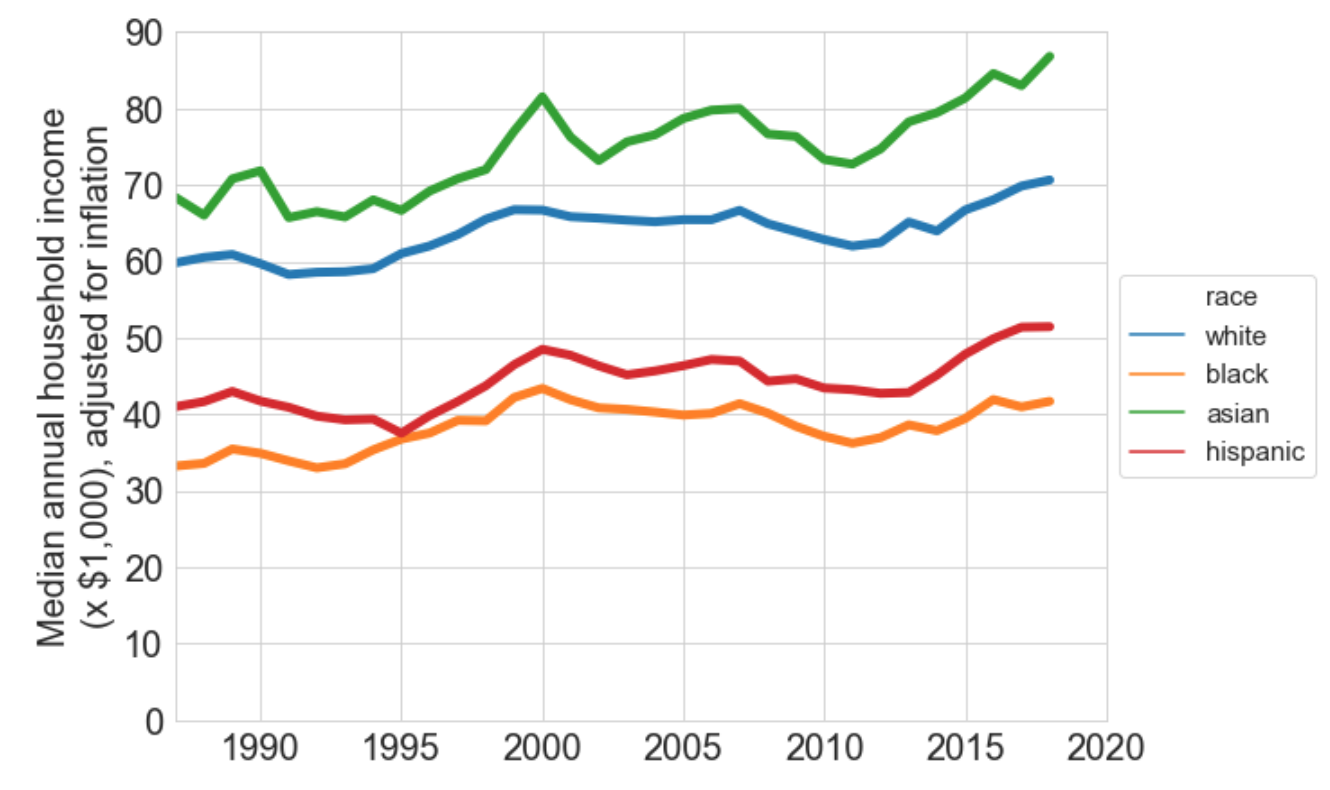
- The rates at which the median household income has improved from 2008 to 2018 varies by race (hispanic: +16%, asian +13%, white +9%, black +4%). The same trend holds for mean income, but the percentages are increased.
Visualizations were created in python from raw spreadsheets downloaded from the Census Bureau website with this notebook