Analysis of 10,000+ fact checks on Politifact
July 20, 2019
Politifact is a handy nonprofit organization that rates the truth value of political statements, mostly by American politicians. I scraped the results of their fact checking since their inception in 2007 and visualized some trends across time, space, and the political spectrum. You can see the notebooks used to scrape and visualize the data in this GitHub repo. A “truth score” was computed for each fact check, on a 0-5 scale, using the following mapping: 0 - Pants on Fire!, 1 - False, 2 - Mostly False. 3 - Half True. 4 - Mostly True. 5 - True.
As with any data analysis, it’s important to keep in mind the caveats and limitations of the results that follow. While I personally judge Politifact to be an unbiased source of truth, there is no certainty that these data are free of bias and that the standards have not changed over time.
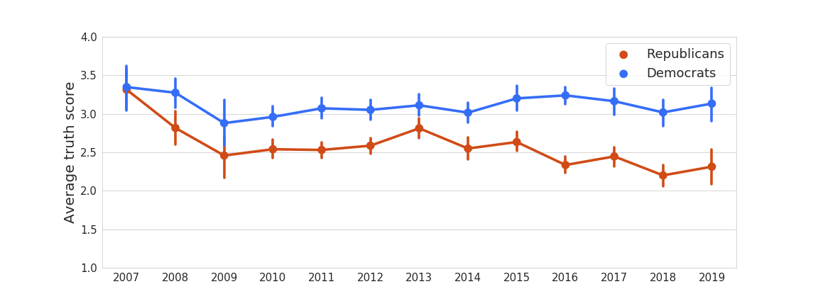
Figure 1. Average truth scores for people affiliated with the Republican and Democratic parties over time.
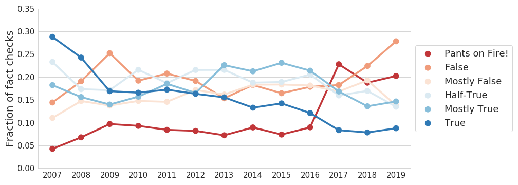
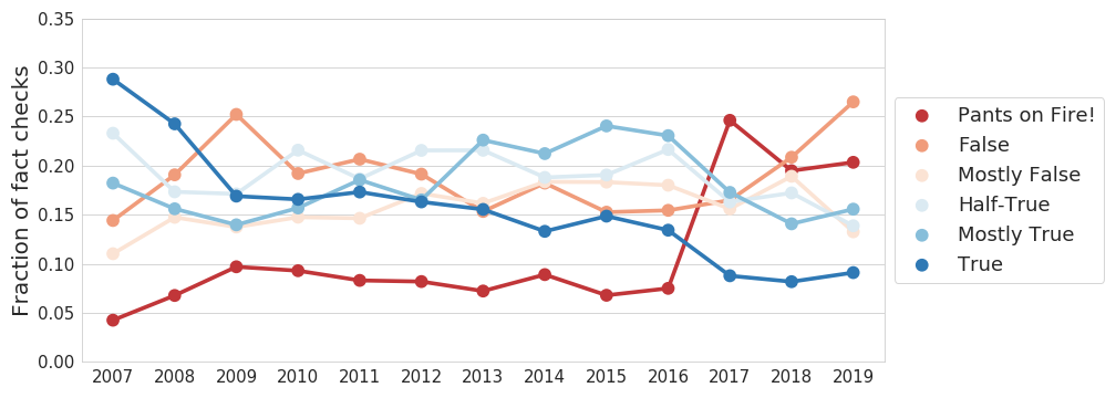
Figure 2. Breakdown of truth results for facts checked each year. Unfortunately, it appears that politicians have been telling relatively more blatant lies relative to true statements. Despite the apparent correlation between the rise in "Pants on Fire!" statements and the start of Donald Trump's presidency, this graph remains essentially unchanged if we remove his data, as seen in
this figure. Notice that the decrease in 2017 is not apparent in the graph above. That means that the contribution here is mainly driven by political organizations, people who were not identified as Democrat or Republican, or other fact sources. Further analysis could be done to investigate this.
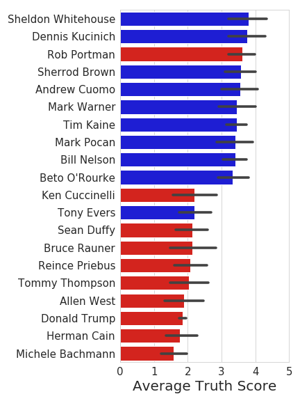
Figure 3. The average truth ratings for the 10 politicians with the highest (top) and lowest (bottom) average truth ratings. The bars are colored by political affiliation, as you would expect (Democrats are Blue. I sometimes get that mixed up.). Only politicians with at least 20 fact checks were considered.
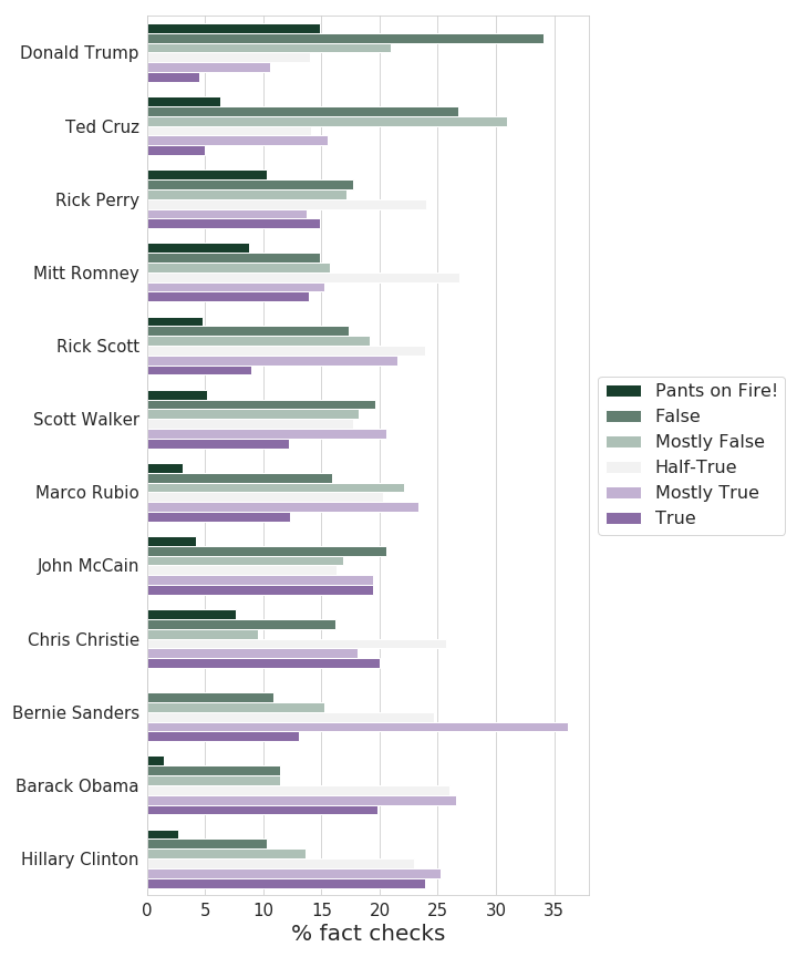
Figure 4. Breakdown of the results by category for each person with at least 100 fact checks. We have an unexpected victor. Within the confidence range of Bernie and Barack though.
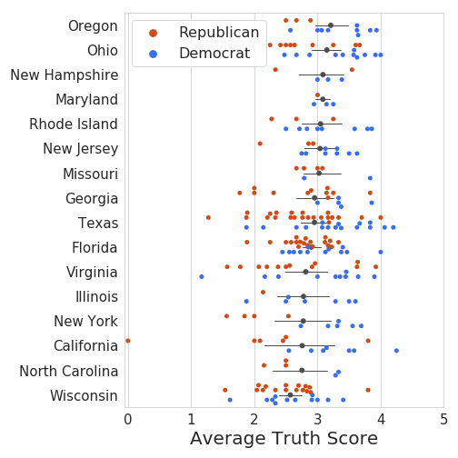
Figure 5. Average truth score for politicians that represent each state. In order to be considered, a politician needed to have at least 5 fact checks, and a state needed to have at least 5 affiliated politicians. Each red/blue dot is a single politician, and the grey dot and bars indicate the average and 95% confidence interval for that state. Lol Wisconsin.
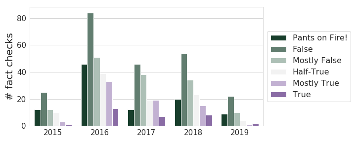
Figure 6. Breakdown of the truthfulness of facts checked for Donald Trump each year since 2015. It appears that he's been speaking a relatively steady amount of bullshit over the years.
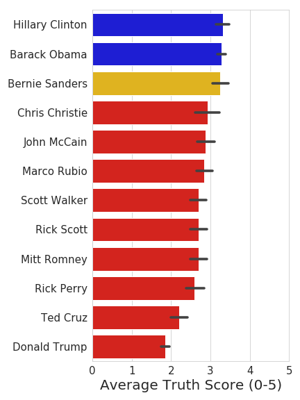
Figure A_1. Average "truth score" across all facts checked by each person who had at least 100 fact checks.
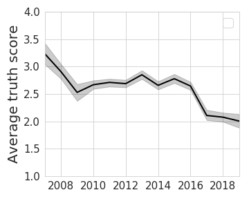
Figure A_2. Average truth score for facts checked each year. Unfortunately, it appears to be declining as time goes on.
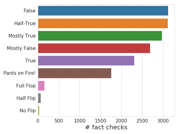
Figure A_3. Number of fact checks that fell in each truth category. In total, I scraped 16,208 fact checks that were posted as of July 1, 2019.
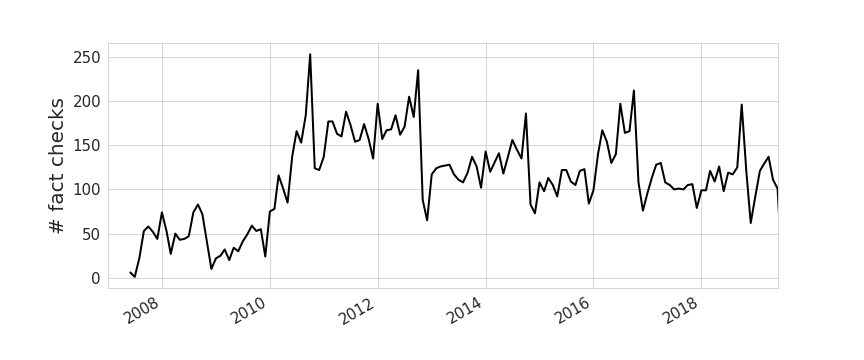
Figure A_4. Number of fact checks performed in each month. Notice the increase in fact checking preceding the November elections every 2 years.
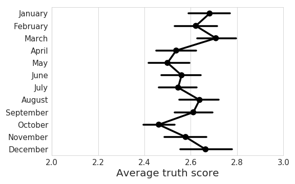
Figure A_5. No apparent change in truthfulness over the year.
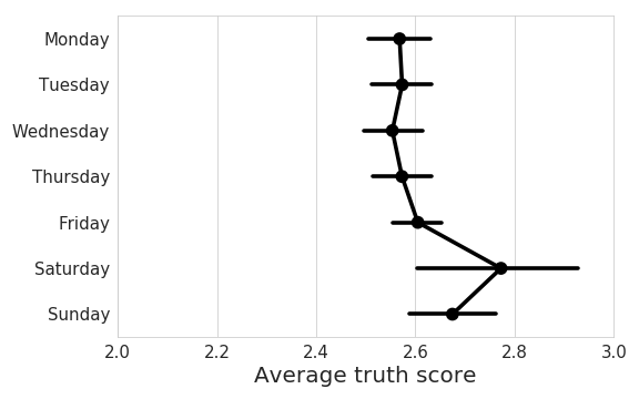
Figure A_6. No apparent change in truthfulness over the week.
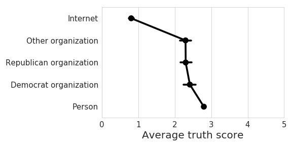
Figure A_7. Statements by people appear to be, on average, more reliable than those by political organization. And much more reliable than the facts checked about rumors on the internet.